So you’ve got a shiny new website, and it’s got a gorgeous full-width feature image in it, right at the top of the page—awesome! Just drop in a good-looking photo, and you’ll be off to internet stardom in no time, right?
Well, maybe not quite so fast. (Where did the tall guy’s head go, anyways?)
Images in the modern internet aren’t always so easy. Most full-width images use a somewhat complicated CSS setting called background-size: cover to create the best possible outcome, across all devices. And there’s good reason for that.
The Thing About Static Images…
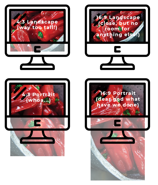
Most photos have an aspect ratio of 16:9 or 4:3. If we just used the full photo, here’s what would happen:
We get similar problems on mobile (though with different ratios/layouts):
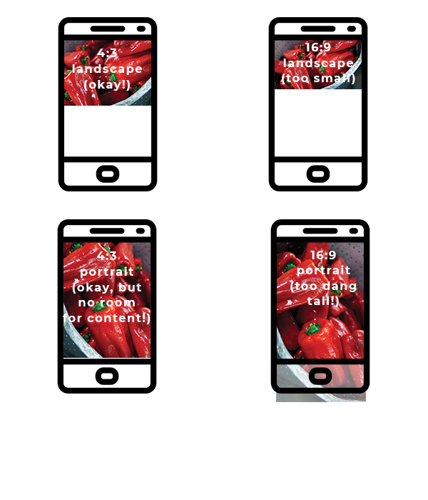
Some of them almost work (4:3 landscape is probably our best option, IMO), but still leave much to be desired on certain screen sizes. Unless it’s the splash lander on your homepage, you generally don’t want an image to take up all the screen area—you want to get some content in there! So why can’t we just use a really wide aspect ratio, like 16:9 (or something even more aggressive)? Well, as you can see on mobile, things get way too small.
Enter Background-Size: Cover!
Wouldn’t it be nice if there was a clean, simple way to say “look, just be X percentage of the height of the screen (so we can still fit some content) no matter what, and then fit as much of the image in as possible”? Yes it would—so there is! That would be the background-size: cover setting mentioned previously.
Basically, background-size: cover separates the image from the sizing of the image area. It says to do things this way:
- Figure out how big the image area should be (e.g. half the height of the screen, and fully as wide as the screen)
- Size the image to just fully cover the area—so we crop no more than is absolutely necessary to avoid leaving any blank space in our image area
- Finally, use the background-position property to decide which part of the image to crop/retain (more on that below).
This enables us to use any image, no matter what the original size is! Here’s how it works:
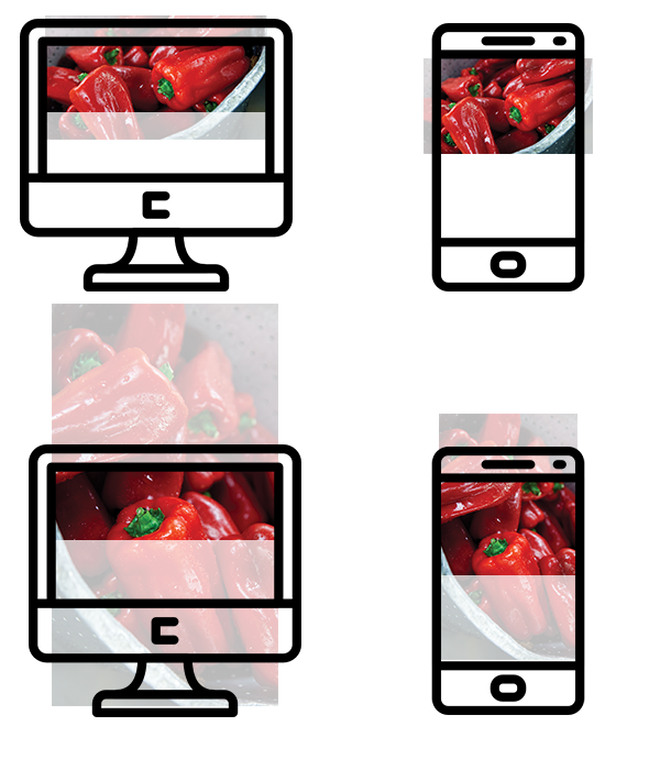
But there’s one key issue with this—because the code tries to be as adaptive as possible to any device, window width, or screen size, it crops the image dynamically, according to its own rules. This means that an otherwise lovely photo can wind up looking weird: faces cutoff, the focus in the wrong place, etc.
With that in mind, it’s worth thinking about what’s probably always visible when selecting a full-width feature image. Depending on how you set the background-position property, that can be one of nine different areas in the image. But to start with, let’s look at how that works with the most common position setting: background-position: center. (That’s the one we’re showing above.) Here’s how it works with a landscape image (and you should always use a landscape image for a landscape-shaped feature area);
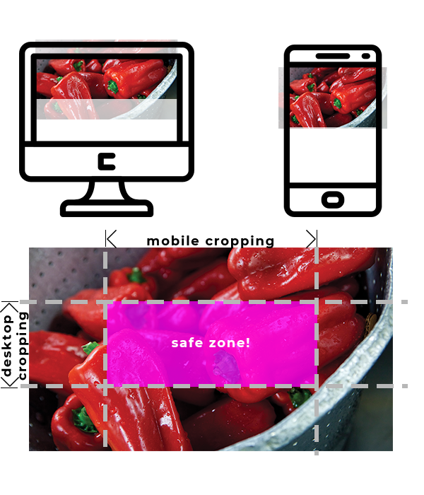
So that’s a pretty good rule of thumb right there—any critical content that has to be visible (e.g. faces, products, etc.) should be in that highlighted part of the image. But we can get a little fancier by changing up the background-position rule to one of the other nine options. Here’s what we’d get, depending what we set that to:
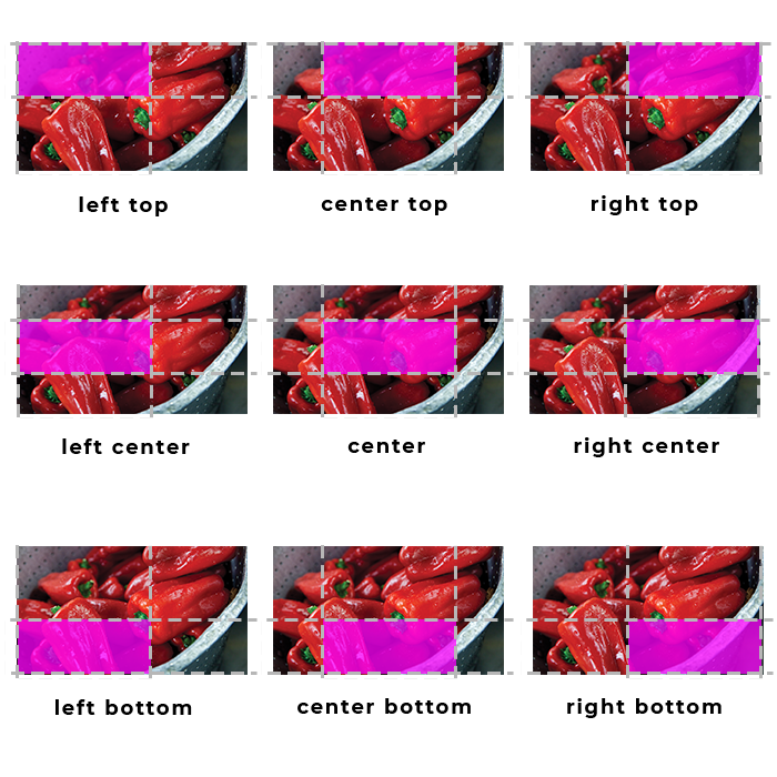
This opens up the ability to use images that have the key content in different parts of the photo besides the middle, which is super helpful. But there are a few more things worth keeping in mind
Good Photos to Pick
Some photos are just going to work better for a feature image like this than others. Here’s a rough guideline for the types of images that we’ve found work well with feature image responsiveness, and those that don’t:
- Good
- Landscapes & cityscapes (super-good!)
- Natural features (trees, cliffs, flowers, etc.)
- Patterns, textures, or pattern-like images (e.g. grass from above, leaves, fabric, etc.)
- Irregular features (i.e. things that are probably cut off in the original anyways—e.g. building complexes, machinery, abstract imagery, etc.)
- One person from a distance (i.e. with all their key parts, especially face, fully contained in the highlighted area above)
- Group of people in a row, from a distance (if you don’t mind people at the edges being cut off sometimes—see highlighted areas to understand what might be cut)
- Bad
- Portraits & close-ups of people or groups
- Anything with text
- Vertical photos or subjects (tend not to fit the highlight box)
- Portrait-orientation photos (these will almost never work well, because on desktop you’re losing 80% of the image)
- Close-ups of a single specific subject (e.g. a plate of food, a product, etc.—unless it fits the highlight area, it’ll be cut off sometimes)
- Photos of a specific action or activity (e.g. a soccer player kicking a ball)
Note that these are general guidelines—the real determinant is the highlight box, so if you’re happy with how that works with your photo, you should be good to go!